Valve’s UI Uproar: Why the New Steam Store Look is Infuriating PC Gamers


Popular Now
 Free Fire
 PUBG Mobile
 God of War Ragnarök
 Stumble Guys
 Valorant
 Genshin Impact
 Candy Crush Saga
 NBA 2K24
 EA SPORT FC 25
 Auto X Drift Racing 3
 The recent broad rollout of Valve’s redesigned Steam store menu and interface has been met with a fiercely polarized reaction, and for many veteran PC gamers, the sentiment is overwhelmingly negative. While Valve’s official stance is that the update aims to improve “discoverability” and simplify navigation, the actual user experience is one of frustration, lost functionality, and a jarring shift towards a design that feels optimized for mobile and touchscreen devices—not the high-resolution PC monitors that form the bedrock of Steam’s user base.
For those who have lived with the old, familiar—if cluttered—interface for years, the new look is a blow to muscle memory and efficiency. The update, which consolidates the old, text-heavy left-side menu and the top blue bar into a sleek, centralized horizontal menu, is an attempt at modernization, but it comes at the cost of immediate information access and PC-centric design principles. The response from the community, as expressed across forums and social media, is clear: “Oh no, I hate it.”
 The Great Consolidation: Hiding Functionality Behind Panels
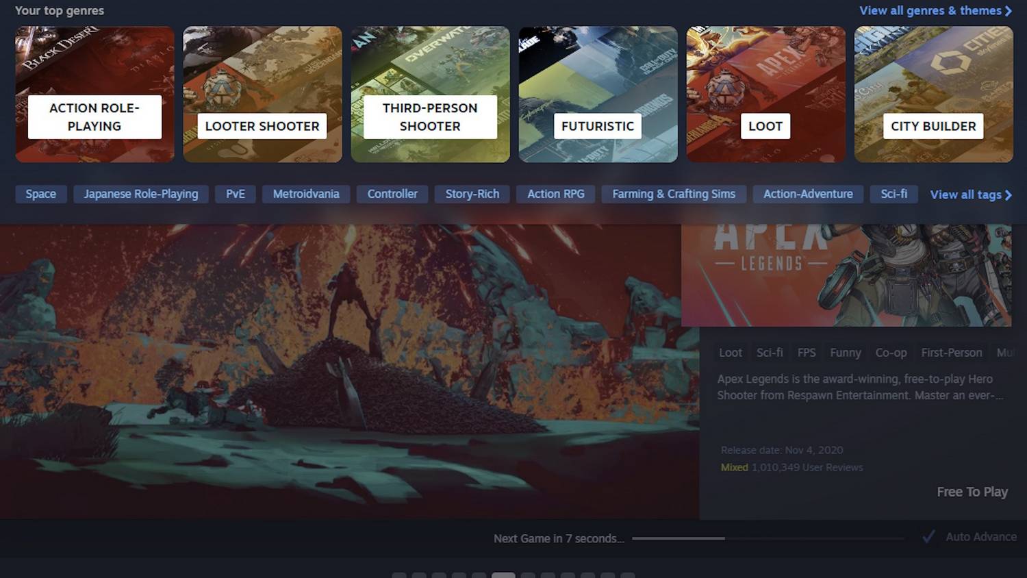
The core of the user backlash centers on the removal of the giant, always-visible left-side link panel and its replacement with new drop-down menus: Browse, Recommendations, Categories, Hardware, Ways to Play, and More. While this looks cleaner, the user-experience (UX) trade-off is significant. The old sidebar was a fire-hose of genres, tags, and quick-access links. The new system forces key browsing options behind multiple clicks or an initial mouse-over, a process many find slower and more convoluted.
- Categories Chaos: The most painful change for many is the new “Categories” tab. It no longer offers the comprehensive, at-a-glance list of genres (Action, RPG, Strategy, etc.) that power-users relied on for quick game searches. Instead, it displays large, blocky panels for a handful of “Your top genres” which are algorithmically chosen and often feel irrelevant or redundant (e.g., both “Looter Shooter” and “Loot” being listed). Finding a niche genre now requires drilling down into the “Advanced Search” or hoping the algorithm cooperates. This significantly impacts game discoverability for users looking beyond the front-page blockbusters.
- Visual Bloat: The new design favors large, mobile-friendly buttons and generous white space. On a standard desktop monitor, this results in less information being visible on the screen at once. Critics lament that the new store pages are “wider” but ultimately display less functional data, forcing more scrolling and feeling less dense and “PC-like.” The aesthetic choice sacrifices information density for a look that many derisively claim resembles a “giant old touchscreen Samsung tablet.”
- Lack of an Identity: Many long-time users feel that the design has lost its unique “Steam-esque” feel. By adopting the modern, minimalist, and multi-platform-friendly UI trends, the store looks more generic, drawing comparisons to competitors like the Epic Games Store. This homogenization is a source of disappointment for a community that values Steam’s distinct, established identity.
 The Resource Hog and Other Technical Woes
Beyond the look and navigation, the updates have also been criticized for performance issues. While Valve has made strides in client stability, the underlying technology, which utilizes embedded Chromium web views, is notorious for consuming significant system resources. User reports suggest that the UI still feels “sluggish,” and the resource usage (RAM and CPU) is still higher than older client versions, leading to a general feeling of de-optimization. For a platform that caters to a massive range of hardware, performance regressions are an immediate and non-negotiable downside.
Ultimately, Valve’s Steam Store redesign is a classic case of an established platform attempting a significant UI overhaul, alienating its most dedicated users in the process. While some features—like the enhanced search bar and better support for the Steam Deck—are welcome, the general consensus is that functionality has been sacrificed for aesthetics. The initial reaction confirms a fundamental truth in PC gaming: users prefer efficiency and familiarity over a clean, modern look, especially when new design paradigms introduce extra clicks and hide essential features. The hope for many is that Valve will heed this widespread, vocal feedback and introduce options for a more compact, information-dense view that respects the workflow of its desktop power-users.
Source: GamesRadar+, PC Gamer, Reddit (r/Steam), Steam Community Forums